Paws up! A webshop to create easy and safe access to handmade unique dog accessories
For this week’s challenge, our assignment was as follows: find a local e-commerce, that does not have a (well performing) webshop.

Our client this week Unleashed, a Utrecht based Instagram shop that sells handmade and unique dog accessories, like collars, leashes, toys and tick bands. She was looking for a more professional way of selling, to acquire more customers, look more professional, have a place where clients can have an easier overview of more types of products and were customers can pay safely.
To start off right, we first conducted some interviews, ran a survey and check our competitors.

Problem Statement
From our potential customers’ insights, we came down to the following problem statement:
Our products were designed to serve dog owners looking for cool, handmade and unique accessories for their pet.
We have observed that the Instagram shop is not meeting professional requirements which is causing not enough sales, not enough new visitors and lack of user anonymity to our business.

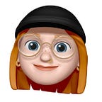
Our main persona, Delina van Rijn, is looking for a place where she can buy fashionable, high quality items for her son (oh no wait, it’s still a dog) Ollie.
To really dive in to Delina’s journey as a (potential) customer, we created an user journey map. Here we see Delina moving from needing a new collar to eventually making a purchase.

Based on the user research, we filled in our UX strategy blueprint. What do we want to focus on? What is important? What do people need?

Next step: creating the best possible webshop
After some decent user research, creating a persona and filling in the UX strategy blueprint, it was time to think of the structure, (potential) website features and creating the first prototypes.


Before the first prototype, we created a quick user flow to see the steps a user would take in order to go from visiting the homepage to eventually making a purchase.

The first prototype
Things are getting real now! Based on our sitemap and user flow, our first low fi’s were born. Based on those, we started our first mid fi which we tested in maze.

Although 68% of our 24 testers were able to complete the mission via our expected path(s), we got some decent feedback from this prototype testing, like:
- Not clear that there’s an “buy now” and “add to cart” button ➡ what’s the difference?
- You cannot click “buy now” or “add to cart”, because you have to select the product type (e.g. the color) before adding to your cart
- User feedback: how do you know that “added to cart” has been succesfully done?
- What is you confirmed, can you go back to the homepage?
With this feedback, we created a next mid fi. In this mid fi, the assignment is to buy the collar Moos in the color blue.
To create more of a brand feeling for our client, we created a first version of an high fi. This way, the clients and team members will get a clear idea of how the product will look and work before it ever goes live. This is a stand alone high fi, and for future research we should dive deeper into testing this.

Next steps
- Finish a complete high fi version
- Test the high fi prototype version
- Add a feature to here it is possible to buy custom made products (for example: “I want a pink combined with blue collar”
- Work out features for other product types
- Make it more accessible for people having difficulties reading/hearing